Metadata
PersonaLive comes with extensive metadata to learn about the segments and make them actionable. Customers have access to our metadata website which provides a online interface to learn about each segment. We often refer to the website that contains metadata for all of our segments as "The Taxonomy".
For our entire metadata on each segment, including thousands of brands, interests, influencers, and more, customers can use our segment and attribute sorters which can be found in your cloud account. You can also learn more about the extended metadata below.
Metadata is broken down into the following sections:
- Overview
- Live Data
- Geography
- In-Store Visitation
- Brand Influence
- Channels
- Social Topics
- Influencers
- Interests
- Demographics
Before we visit these sections, it's important that we explain a very common mechanic that is common in our metadata, the index score.
Index Scoring
In our taxonomy, you will regularly see scores integer scores next to various brands, influencers, attributes, and more. For example:

These score are indexed to the national average, where the national average is represented by a score of 100. So, in the above example, this segment (#RoaringRetirees) is 1.54x as likely be interested in Golf Digest. The general formula is:
Let's say that, on average, 1% of Americans engage with Golf Digest on social media. In that case, a segment that has 1.54% of it's members interested in Golf Digest would have an index score of 154.
Other than index scores, most other numbers in the metadata should be pretty intuitive. Let's dive into the various sections of the taxonomy.
Overview
This is your summary page for any given segment, providing top level insights from each section of the metadata. All of the data that you see on this page can be further explored in each section of the taxonomy, so we won't spend too much time describing the specific data this section.
What is unique to this page is that it provides each segment's name, image, code, typical household age and income, and percentage of the population.
Live Data
The live data page is designed to help you understand what matters to your segment right now, and to track trends over time. It's one of the most exciting parts of the PersonaLive metadata. You can see what each segment is talking about on social media and how in-store visitation is changing. Let's check it out.
Live Social Topics

Live social topics reflect the hashtags being used by this segment right now. These are hashtags that this segment is overindexing on relative to other segments as well as relative to time (this hashtag is being used more now than in the past).
Live topics are calculated using Twitter and Instagram data. Use this section to find opportunities for engaging with customers and more.
Live In-Store Visitation
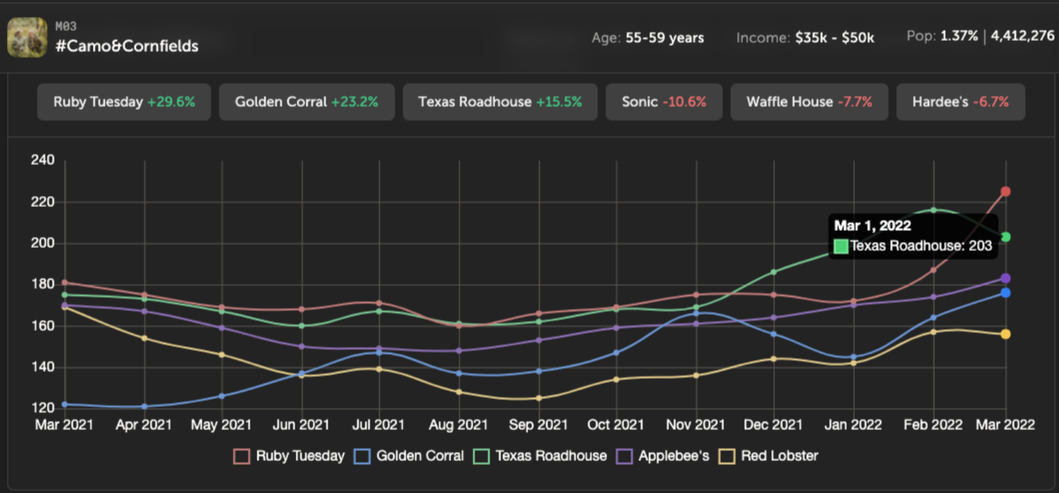
This captures a 12 month running snapshot of a segment’s visitation to a brand. By default this will include the top five brands with the biggest lift over the most recent month. Live in-store visitation is updated weekly.
In the example above, we see people in segment M03 #Camo&Cornfields were 2.03x as likely to visit Texas Roadhouse as the average person with an index of 203 in March 2022. This indicates Texas Roadhouse is gaining traction with this segment.
Geography
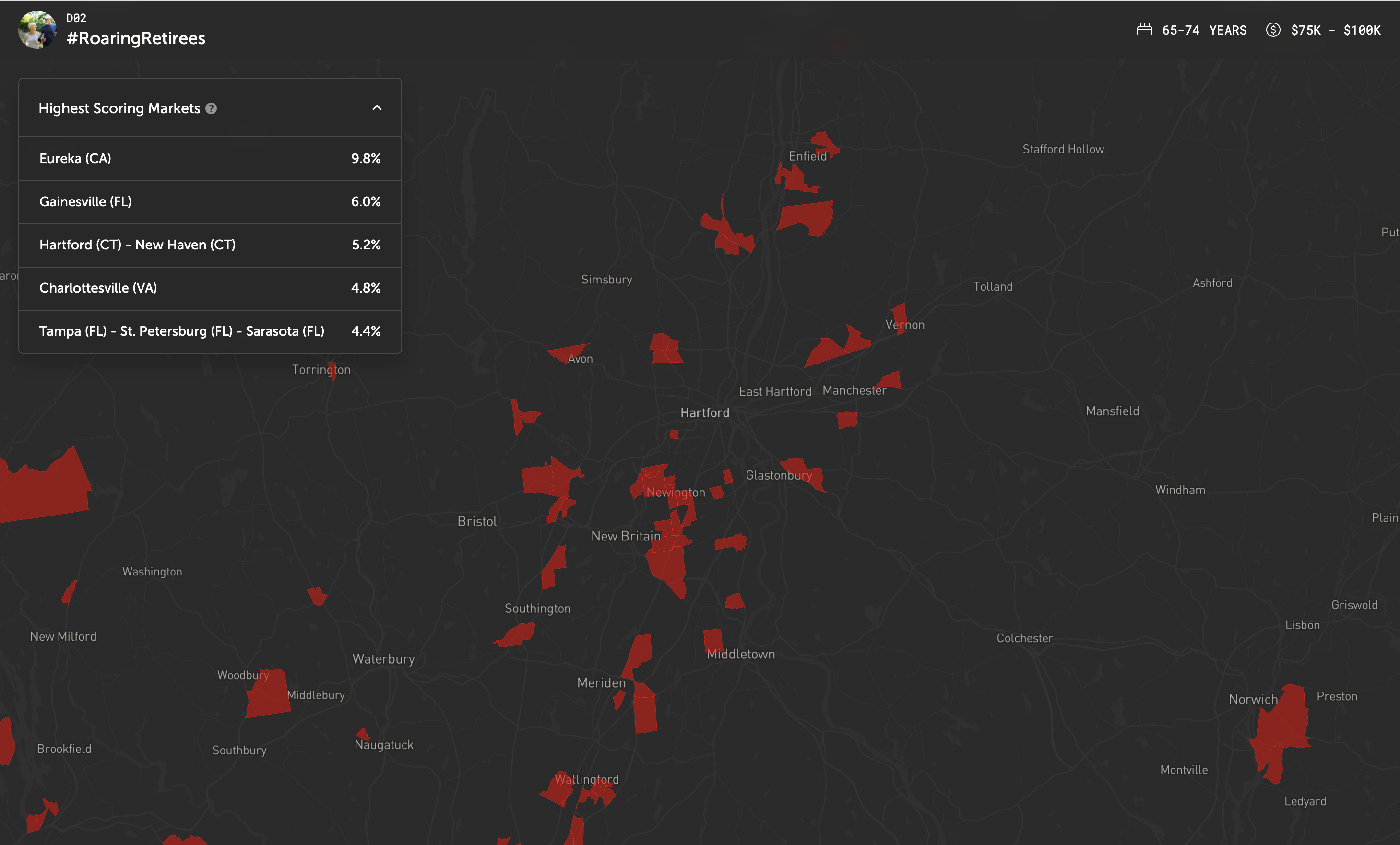
The geography page is a national map highlighting the block groups that are dominant for a given segment. The primary use of this is to give a quick sense of how rural or urban a segment is, how likely the segment is to live in certain regions or near certain topographical features like mountains, lakes, or oceans. We also rank the highest scoring markets for a given segment.
In the screenshot, we've zoomed in on Hartford (CT), which is the market with the 3rd highest concentration of #RoaringRetirees of all markets in the USA.
In-Store Visitation
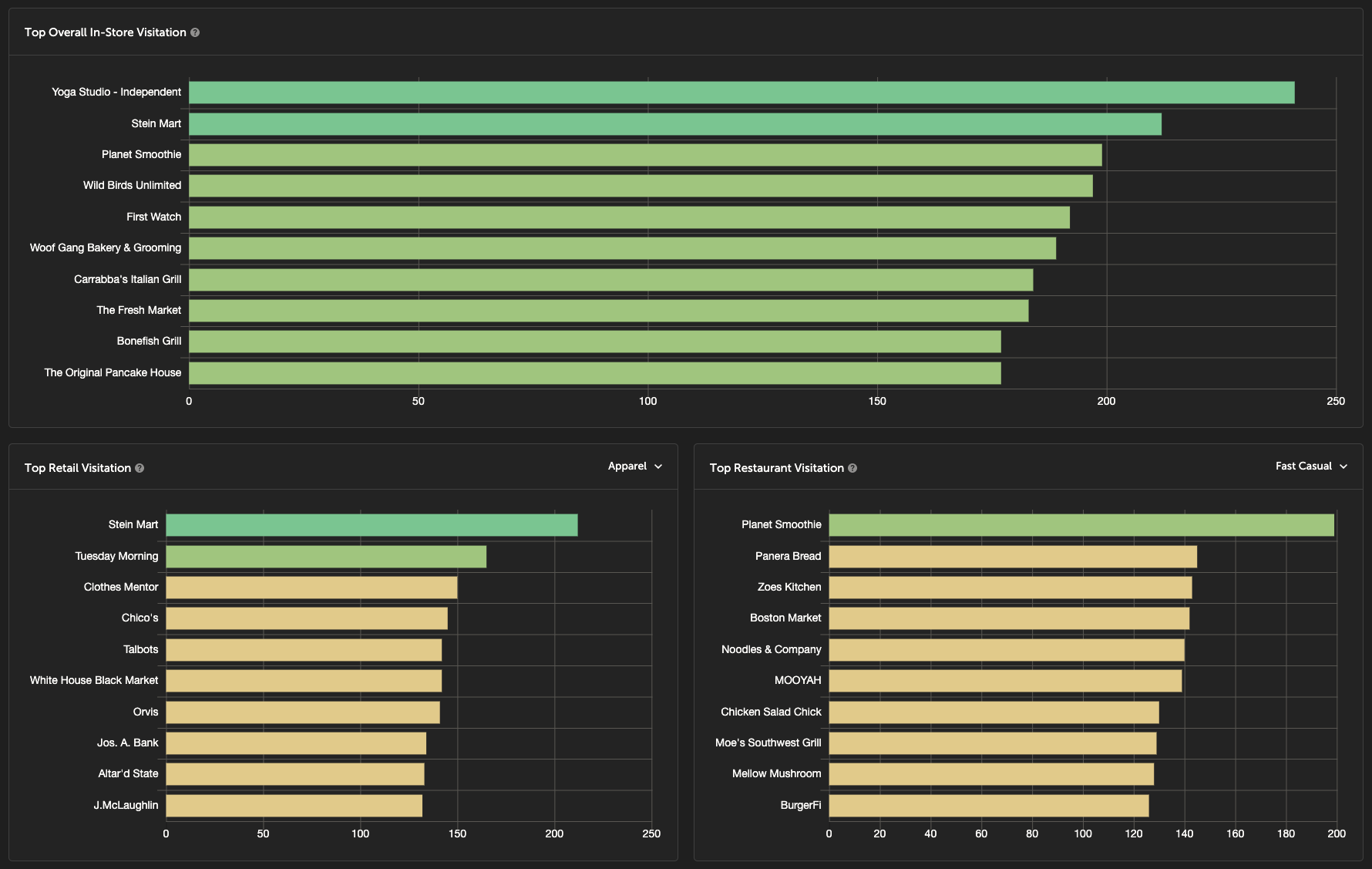
This section shows the brands, businesses, and points of interest which this segment over-indexes on visiting relative to the national average. The data is calculated by measuring the mobile phone visitation patterns.
This can be useful when trying to identify an excellent retailer for an open location based on the surrounding population, or for personalizing creative by making sure models are wearing the brands and styles the segment has an affinity for.
Indexes are calculated using visitation percentage (or "share"). If 2% of #RoaringRetirees' visits go to Stein Mart but nationally only 1% of visits go to Stein Mart, then this segment has an index of 200 for Stein Mart. We do take into account whether a Stein Mart is available when calculating these values.
We've broken down the businesses into several different categories (such as Retail-Apparel, Retail-Home Improvement, Restaurant-Fast Casual, etc.) for enhanced usability and understandability.
Brand Influence
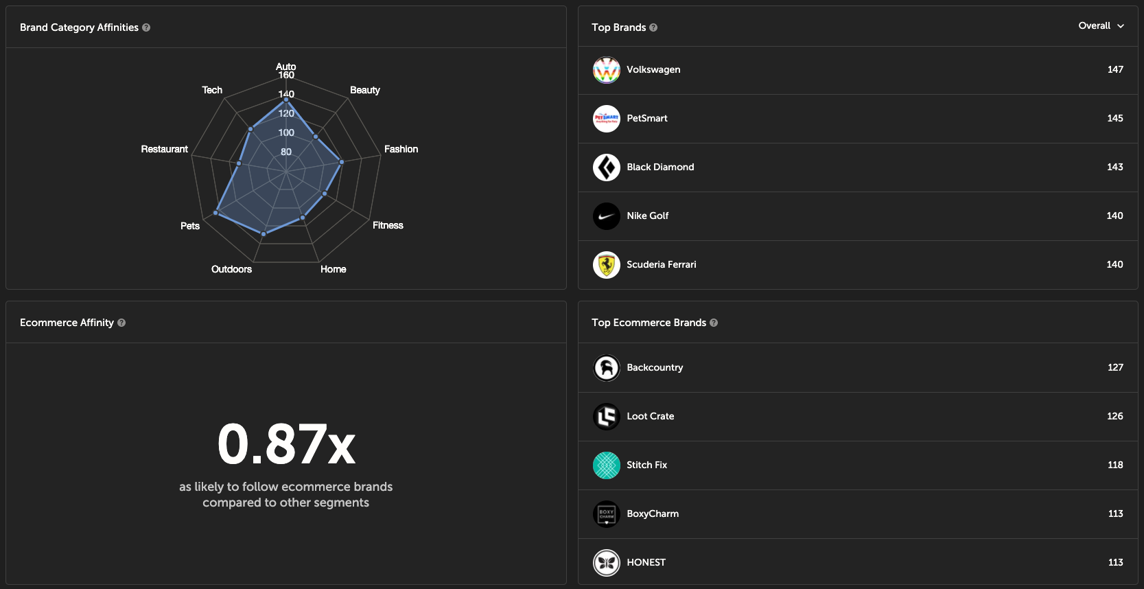
The brand influence page is designed to show you which brands a segment follows on social media. Using the Brand Category Affinity radar map you can get an overall understanding of brand interests for a segment. You can drill into any category to see which brands a segment follows.
Brand influence also comes with a gender sorter that allows you to see changes in following patterns based on the gender of the people in the segment.
Channels
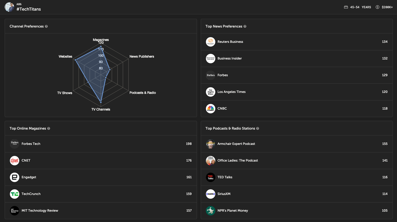
The Channels section uses the same approach as the Brand Influence section (index of social media engagement compared to the national average), but focuses on "marketing channels", or the places where you might be able to reach a customer. As you can see in the screenshot, that includes websites, news sources, TV Channels, TV shows, podcasts, and more.
This section helps a user understand where to allocate media dollars across channels when targeting a certain segment. The specific accounts within each channel help optimize ad placement.
These are designed to direct media budget allocation, direct ad placements, and by looking at the individual accounts followed you can get a good sense of the types of people who are in a segment. For this example, here is the segment A06, #TechTitans. There are 2 sections on this page that are calculated slightly differently, so we're going to go into brief details on those.
Out of Home Exposure
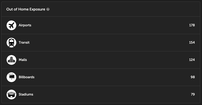
Understanding how individuals can best be reached via out of home advertising is not necessarily answered well by using social media (as the other things on the channels page are). So, we used a combination of datasets to generate values for the above chart, while still using the same indexing approach.
| Value | Source |
|---|---|
| Airports, Malls, Stadiums | Calculated using same approach as the brand visitation indexes, using mobile phone location data. |
| Billboards | Calculated using Census data, specifically mode of transport to work. Calculated as percentage of people who commute via car divided by the national average. |
| Transit | Calculated using Census data, specifically mode of transport to work. Calculated as percentage of people who commute via public transit divided by the national average. |
Social Media Platform Usage
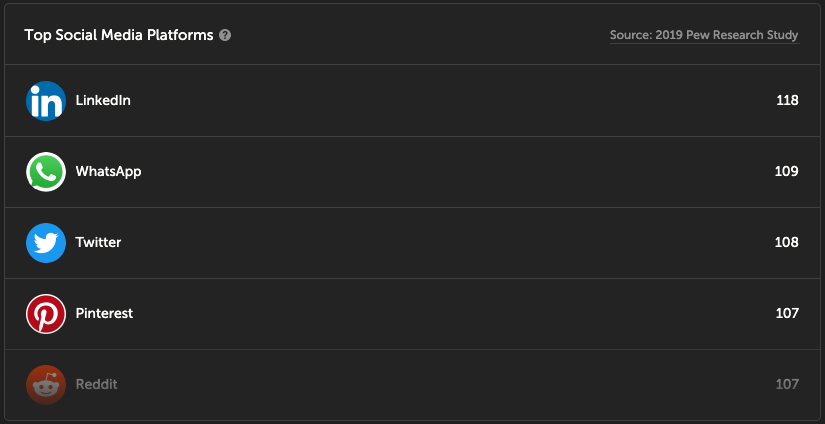
Ironically, though we collect social media data, it's not necessarily straightforward to use this data for estimating platform usage. This section was estimated using data from a 2019 Pew Research study.
Social Topics
The social topics page is designed for the creative team to understand the lifestyle and interests of a segment, what is relevant right now, and plan for what may be relevant in the future based on previous segment social topic trends.
Social Media Frequency
This section tells you how many times per week users in this segment tend to post. Note that this is a simple average for the social media users in a given segment.
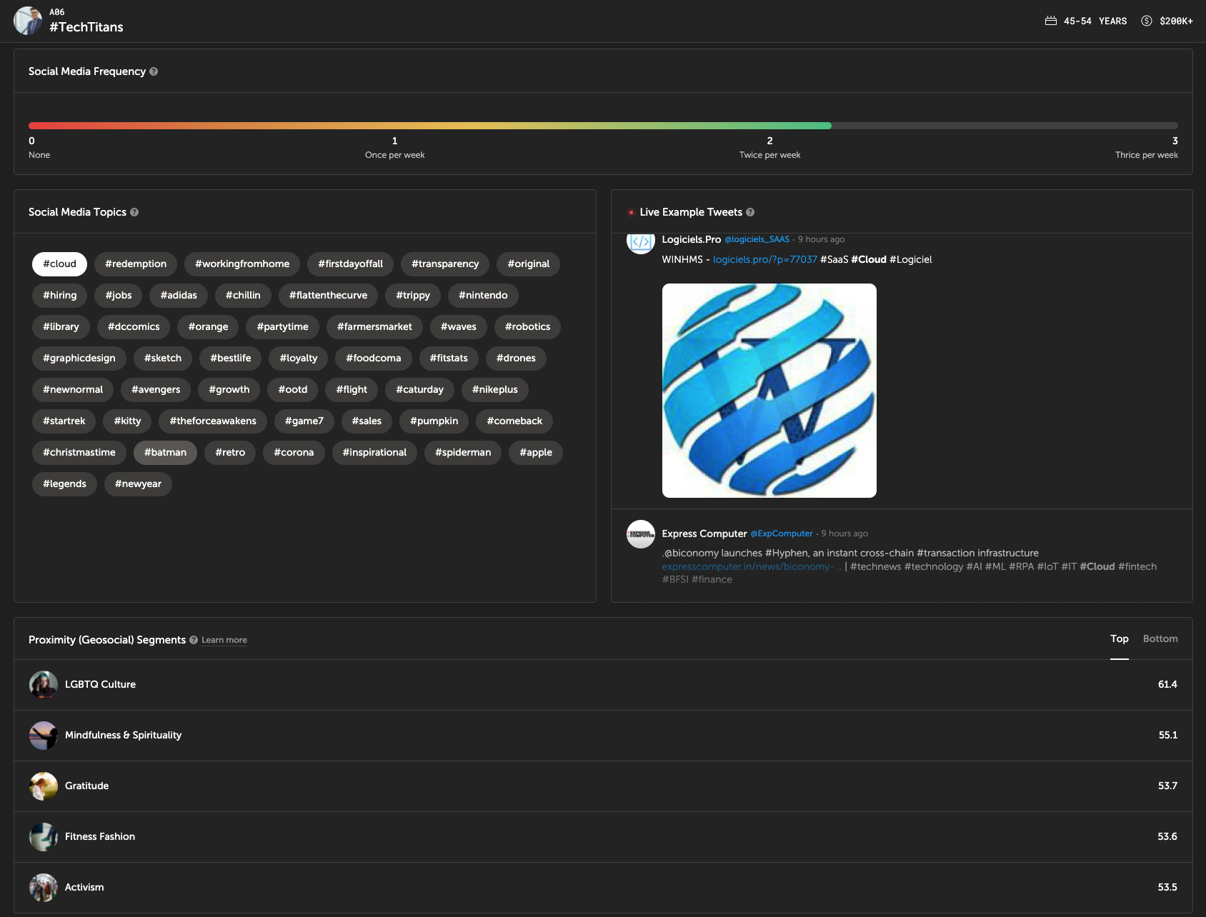
Social Media Topics
The topics section provides a list of hashtags that this segment uses at a higher rate in general than the average social media user. We also provide a companion panel which shows recent tweets using the listed hashtags. For example, the top hashtag for #TechTitans is #Cloud. The screenshot shows tweets that contain this hashtag.
Proximity (Geosocial) Segment
This section shows the top Proximity segments from Spatial.ai's Proximity dataset in areas where the given PersonaLive segment is present. We understand this may be confusing... our Proximity Dataset is a separate dataset from PersonaLive that focuses on geolocated social media alone. In short, the Proximity dataset scores areas based on the text of geolocated social media being posted in the area.
For example, #TechTitans's top Proximity segment is LGBTQ Culture. This means that areas in which #TechTitans live tend to score highly for LGBTQ Culture. This makes sense-- Tech Titans are heavily located in San Francisco and other places known for flourishing LGBTQ culture.
Influencers
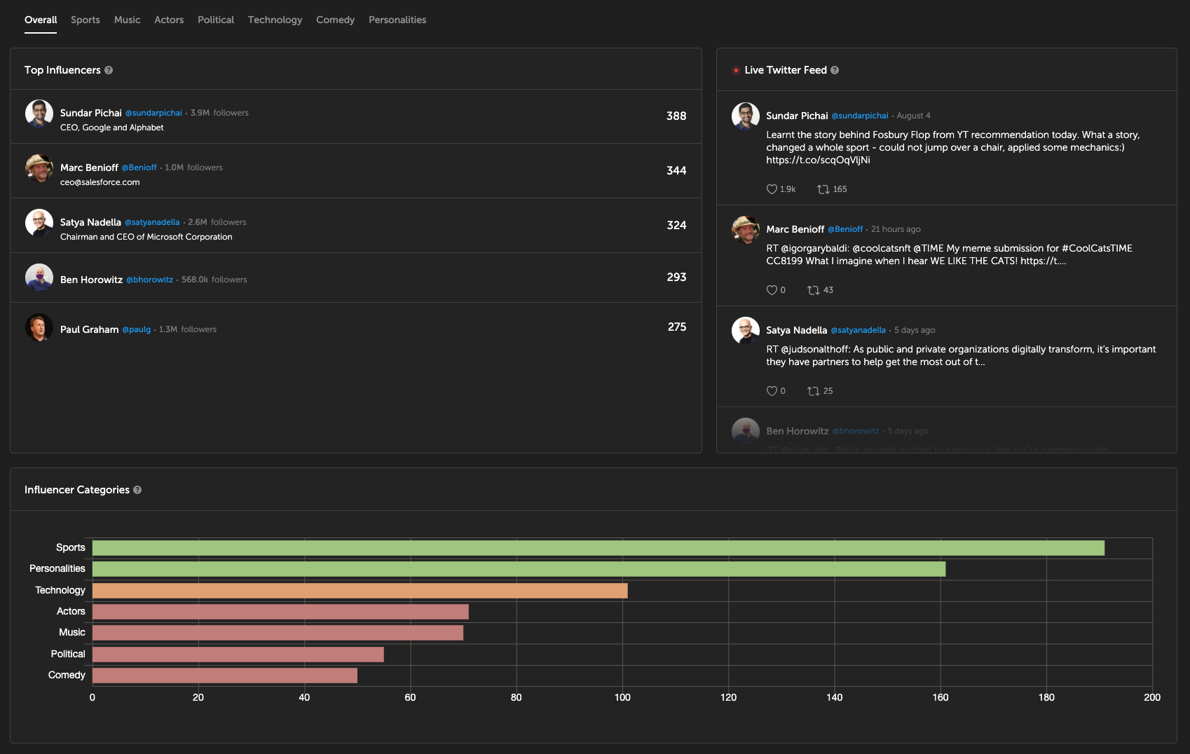
Beyond simply learning what interests your top segments, the influencers tab is designed to indicate the social media accounts that are capturing the mindshare of your top segments.
You can switch between categories of influencers and even see a live twitter feed of the posts being made by these influencers. As you can see, #TechTitans tend to follow tech leaders and VCs, such as Sundar Pichai and Ben Horowitz.
Interests
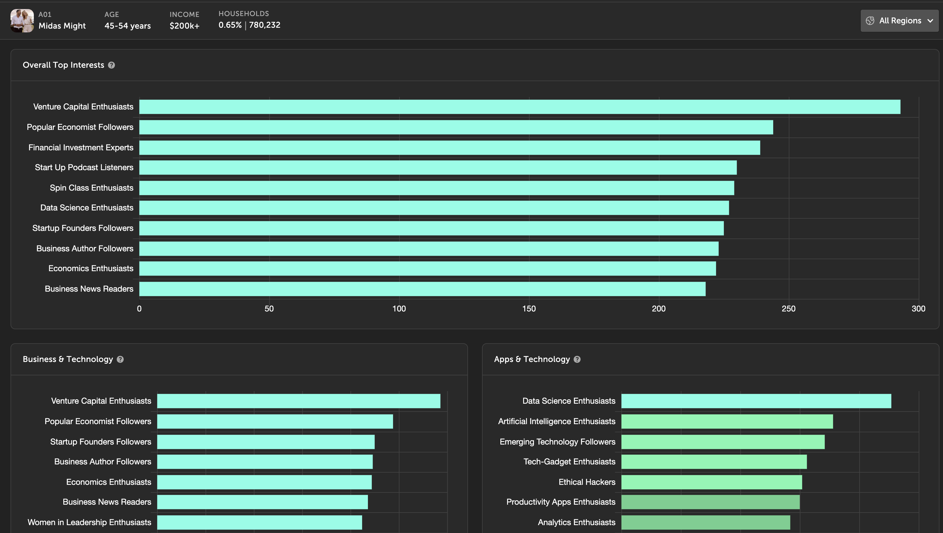
The Interests section highlights how a segment over-indexes on themes from a curated subset of FollowGraph Interest variables (the category of scores built from groups of social accounts rather than individual handles). That includes activities, media, brands, and related affinities, beyond raw social topics, retail visitation, or demographics alone. FollowGraph scores are rolled up and linked to PersonaLive segments for presentation in the taxonomy.
Demographics
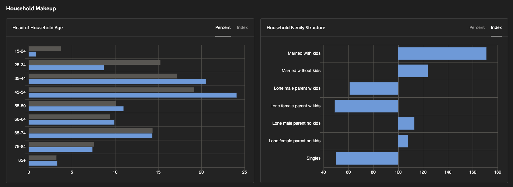
The demographics section shows basic demographic variables for each segment. These demographics describe the makeup of areas where this segment is dominant. This data comes straight from the census and is shown in both percentage (in the screenshot on the right) and index (on the left) form. We've included variables related to:
- Household Composition
- Ethnicity
- Income
- Education
- Occupation
- Population Density
- Home Ownership
- And more...
Demographics will always be important. PersonaLive innovates by not only using demographics but also the many other datasets we've already gone over in this metadata section.
Extended Metadata
While the taxonomy website is an incredibly useful tool to get to know the segments, it focuses on the highest indexing values for every segment. What about the lowest values? What if I want to see all the values for my brand (or any brand)? That's where our extended metadata comes in handy.
All Spatial.ai customers receive access to our extended metadata, which comes in spreadsheet form and contains the same metadata that is in the taxonomy but for all the brands, businesses, and social media accounts we have.
For example, all it takes is a simple sort to create a table that ranks segments by their index score for visiting Lululemon...
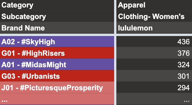
You can do this for any of our metadata types. The extended metadata includes sections for Demographics, Influencers, Channels, In-Store Visitation, Interests, and Brand Influence.